I can't let go of "The Dunning-Kruger Effect is Autocorrelation"
Organizing my thoughts regarding an argument about the Dunning-Kruger study and statistics in general
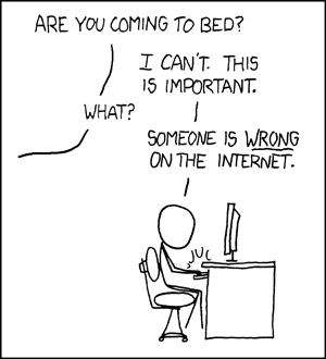
xkcd 386: Duty Calls
We can all relate, but for years I thought myself relatively immune to this. Of course, I’m not; all it took was the right trigger. But before I get ahead of myself: in a moment I’ll link to the triggering article, the ensuing discussion, and explain myself.
Before that I’d like to open with a short explanation of how I view statistics, in general and in relation to the issues at hand. This way, hopefully, disagreements can be traced back to conflicting views about how we come to hold and update beliefs about the world, and can be discussed from first principles.
Statistics and learning about the world
We don’t need statistics to learn about the world. Prehistoric man did not need fancy math to be free from worrying that the sun will not rise tomorrow, or learn patterns in the weather and plan accordingly. Children don’t calculate p-values to determine the best tactic for getting another 10 minutes before going to bed.
In modern science, however, statistics has become inseparable from learning new things about the world: across diverse disciplines, any paper trying to convince you to change your beliefs about something had better be backed by statistical analysis of concrete evidence, or else it’s discarded as anecdotal and sloppy science. This fact is worth contemplating: why is statistics the “stamp of quality” of (a lot of) scientific research?
Statistics and surprise
The history of statistics is well out of scope for this post, but very succinctly, my answer is that statistics is an attempt to objectively quantify surprise.
Surprise is a key mechanism in learning: if I’m not surprised by something, I anticipated it, so there’s nothing new for me to learn. If I am surprised, it indicates a conflict between my model of reality and reality, and since reality always wins, I ought to update my model.
But surprise doesn’t scale, and it’s subjective. You can’t do an experiment, then show it to a whole lot of people and see if they’re surprised; and even if you did, you’d get a lot of different reactions. Do you take the majority’s opinion? Listen to the minority of experts? It’s messy. So you try to quantify surprise: starting with some reasonable belief about the world, would people be surprised by given evidence?
Here’s how frequentist statistics approaches this:
- Translate your initial belief to mathematical assumptions (e.g. independence of random variables)
- Collect data
- Calculate how likely it is to randomly get results like those you got, if your assumptions were true
- If that probability is small - you’re surprised! Promptly adjust beliefs about the world
This procedure certainly has its drawbacks, but it makes sense: if used in good faith, over time you’ll be able to correctly update your world model as you gather evidence on various phenomena and challenge your initial assumptions.
(Bayesians don’t like being surprised and forced to abruptly shift their world view all the time, so they parameterize the whole belief space, encode their assumptions as priors, and update their beliefs as data is collected. But don’t let their smooth act fool you, they’re still surprised.)
All this has the caveat that people hack data and methods to support false or unbased conclusions for their own interests. But statistics is neither the first nor the worst tool to be abused maliciously, and while we should make abuse as difficult as possible, just because it can be abused doesn’t mean it’s not a good tool.
Analyzing state census
Enough with abstract philosophical talk, let’s look at some concrete data and talk philosophically about it. I’ve pulled 2000 and 2010 US state census data. I’ll designate the census population count for each state in 2000 as the variable X, and the count in 2010 as the variable Y. For convenience of display I filtered out the biggest states, so they don’t mess up the scale of the plots.
Plotting X vs. X
Why? For no other reason than to show that nothing bad happens if we do this.
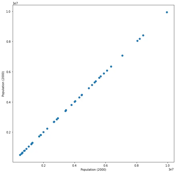
We get a perfect line representing the trivial identity X = X. Surprising? Not at all. Of course, if we’ll use a statistical test, e.g. calculating Pearson’s correlation coefficient, we’ll get perfect correlation and a p-value indicating great surprise. But that test makes assumptions, and specifically one of them is that the paired samples are independent. It certainly doesn’t make sense to assume X is independent of X - they’re identical! So using a test whose assumptions contradict our beliefs (or knowledge, in this case) doesn’t tell us anything. We certainly don’t learn anything from this exercise, but assuming I don’t try to use the small (but meaningless) p-value to convince anyone of some falsehood, no harm done.
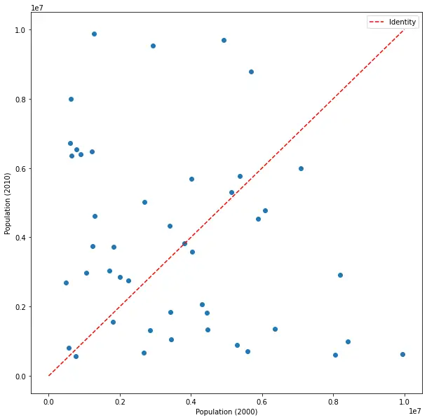
Plotting X vs. Y
We see a very strong correlation between the census counts of 2000 and 2010. Surprising? Not at all. Big states remained big, small states remained small. There are fluctuations, of course, but the vast majority of people remain in their state, with movers across states, immigrants to and from the US, and deaths and births mostly balancing out, slightly leaning towards growth as can be seen from comparison to the dotted line denoting the identity X = X from the previous plot. This identity actually helps us in this case, as otherwise it would be more difficult to see that most states’ populations have grown.
Pearson’s correlation coefficient will still be very significant (though the correlation now is not perfect), but again, it’s clear intuitively that it doesn’t make sense to assume that the census in 2010 will be independent of the census in 2000. This plot will not be making any headlines.
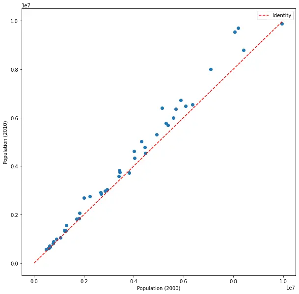
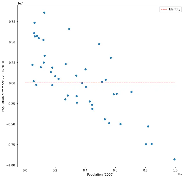
Plotting X vs. Y - X
This shows us the change in population in each state, vs. the initial population in the state.
The red line, again, shows what we would have seen if there was no change. We see that almost all states’ populations have grown, but maybe more interesting - that bigger states have grown more. Though the correlation in this plot is much weaker than in the previous two cases, it’s still quite strong and very significant. Surprising? Not really, but slightly less trivial than the last two cases. In any case it’s potentially useful, as it can give us an indication of how the growth rate depends on size. Also, note that we’ve introduced a new random variable (Y - X), but although, by definition, it includes X, the correlation between X and this new variable is weaker than the correlation between X and Y. Nothing surprising about that (X and Y are highly dependent), just making sure to mention this here as it will be relevant later.
Plotting X vs. shuffled Y
Indulge in my oddity for a moment: let’s shuffle Y (the 2010 census) across states, and plot X vs. this shuffled Y.
And let’s pretend this is the real census 2010 data that was collected.
No correlation to be seen here, and Pearson’s correlation coefficient isn’t significant at-all (p-value about 0.11). Surprising? Very! (Remember, we’re pretending it’s real data.) This means people are moving all over the states, almost everyone, in massive scale. How can the most surprising result come with the least significant p-value? You guessed it, because of contradicting assumptions. Shuffling the census might not make sense in our data, but it creates a situation that’s much more compatible with the test’s independence assumption - this way there really is no (or very little) dependence between X and (shuffled) Y.
Plotting X vs. shuffled Y - X
Let’s try looking at the change as function of size for the shuffled data.
Hey, there’s a correlation there! It’s negative this time, and actually stronger (in magnitude) and more significant than in the real case. What is going on? Nothing new, really. This is the exact same data from the previous plot, shown in a different lens. As the states were shuffled, larger states were more likely to be given smaller states, and smaller states were more likely to be given larger states. Contrasting X and Y - X gives us a correlation not because X appears on both sides of the equation, but because of a very real, concrete phenomenon that’s experienced by the few people not moving around: if you’re in a big state, you’re likely to see a lot of people moving away; and if you’re in a small state, you’re likely to see a lot of people move in. That’s a very interesting phenomenon, and very different from what we’d expect.
Except it’s fake, of course. That makes it much less interesting.
Statistics and intuition
The key takeaway from all this statistical philosophy is that statistics and intuition aren’t in competition. Statistical tests aren’t (or at least shouldn’t be) arcane formulae that crunch the data and give results we should believe even if they contradict our common sense. Rather, they should complement each other, with common sense guiding the choice of methods and assumptions, and statistical tests fine-tuning and quantifying intuition.
Unfortunately, I’ve seen too many cases of statistics classes leaving students with the former impression rather than the latter, detaching statistical practice from intuition, and embedding in them strict adherence to rules-of-thumb that make sense most of the time (and will help them pass the exam), but not the ability to recognize situations where these rules don’t apply or apply differently.
One of those rules, the one at the crux of this post, is the infamous “always assume independence.”
The Dunning-Kruger Effect
In 1999, psychology researchers David Dunning and Justin Kruger published the paper “Unskilled and Unaware of It: How Difficulties in Recognizing One’s Own Incompetence Lead to Inflated Self-Assessments”, in which they show evidence of… you can guess. Roughly, what they did was administer tests to psychology undergraduates in 3 domains (humor, logical reasoning, grammar), and after the test asked students to assess their performance on the test.
Their results can be summarized in the following type of plot (this is for the test in humor):
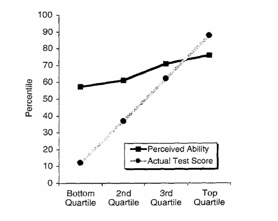
So what do we have here? First, they grouped all subjects into four quartiles by actual performance, and they show the mean performance by performance (lighter plot), which looks like the identity. No surprises so far. Then, they also show the mean self-assessment by performance. Comparing the two, we can clearly see a gap between them: until the 3rd quartile, people tended to overestimate their performance; by the 4th quartile, they tended to underestimate it. Also, it seems that the biggest gaps are at the first and second quartiles, in that order.
From here the way is short to the conclusions made by the authors: unskilled people overestimate their performance, experts underestimate it, and the less skilled people are, the worse they are at estimating their performance.
Since being published, this effect has been called the Dunning-Kruger Effect, and it has received a lot of attention, both academic and from the media. Most of the follow-up research supported the initial results, and generalized them to other cases.
This is a good place to say that I’m not overly attached to the entire Dunning-Kruger Effect. It’s juicy, yes, and I don’t have any particular issue with the paper, but it certainly doesn’t mean there aren’t any. I have no idea how they conducted the experiments or how they treated the data, and we need to keep in mind the context of the experiments and not overgeneralize.
What I am going to focus on is a specific critique of the specific type of plot reproduced above; this might seem petty, but to me the plot, criticism, and reactions opened a whole Pandora’s box regarding people’s relationship with statistics.
The Dunning-Kruger Effect is Autocorrelation
This is the article that set off my little statistical crusade. I think it’s written quite well, with very convincing rhetoric and interesting analysis. But it hinges on a subtle premise that, from my perspective, leads the author very far from reason.
Basically, the author is making the case that the Dunning-Kruger effect is nothing but a statistical artifact resulting from the way Dunning and Kruger analyzed their data, showing it using plots like the one above. The author correctly identifies that what’s interesting about the plot is the gap between the line indicating the actual performance, and the one indicating the self-assessment of said performance. If we call the actual performance X and the self-assessment Y, then we are interested in the correlation (or lack thereof) of X vs. Y - X. They then show that randomly sampling X and Y in an independent manner leads to a similar plot, and conclude that since the effect is present in random data, it’s a statistical artifact and not an interesting property of human psychology. They explain that the artifact arises due to comparing X and Y - X (where Y - X contains X), calling this “autocorrelation” (that’s not the typical use of the term autocorrelation but let’s put that aside).
After reading the article, I thought about it for a while, and found that I strongly disagree with the conclusion. I wrote my opinion on HN (where I saw it in the first place), and quickly found out that a lot of people disagreed with me. We exchanged comments, and I truly considered everything written in response to my comments, but my opinion remains unchanged. I’ll try to present it now in a more organized fashion, starting with the preliminaries you’ve read above.
Common sense and making reasonable assumptions
Imagine we’re Dunning and Kruger, planning the experiment. When the topic of analysis is broached, we have a decision to make: what are we going to assume? How are we going to quantify our surprise from the results?
- The first option is, as in the case of the state census, to assume dependence between X and Y. I.e. to assume that, generally, people are capable of self-assessing their performance.
- The second option conforms with the Research Methods 101 rule-of-thumb “always assume independence.” Until proven otherwise, we should assume people have no ability to self-assess their performance.
It seems to me glaringly obvious that the first option is much, much more reasonable than the second. Yes, we know people aren’t perfectly capable of self-assessing performance:
- There are overly-self-judgemental people who tend to underplay their achievements and suffer from continuous self-doubt
- There are boastful people who exaggerate and aggrandize themselves and their achievements (and really believe it)
- And a lot of other cases that come to mind when thinking about people who lack self-awareness
But then, we live our entire lives based on the assumption that we can self-assess, and that other people can too:
- Think of something you did today, anything. Did you dedicate thought to how well you performed? Did you immediately discard that thought saying “Nah, I can’t possibly know how well I did”? If you tell me you didn’t have a single serious thought of self-assessing today, even semi-conscious, I simply won’t believe you.
- Any sort of practice, training or self-learning would be completely impossible without continuously monitoring our own performance.
- Countless decisions and micro-decisions hinge on our ability to judge our performance: do I look good? Should I apply to that job? Was that the right thing to say?
This is the crux of the argument, but it’s also where I feel there’s the most potential resistance. “Never assume dependence” gets so ingrained that people stubbornly hold on to the argument in the face of all the common sense I can conjure. If you still disagree that assuming dependence makes more sense in this case, I guess our worldviews are so different we can’t really have a meaningful discussion.
Dunning-Kruger analysis on random data assuming dependence
Let’s generate random data that conforms to the assumption of dependence between X and Y, and see how it looks through the lens of the Dunning-Kruger analysis. Here X (the actual performance) will be normally distributed, and Y (the self-assessment of performance) will be equal to X + scaled-down normally distributed noise. I’ll generate 1000 samples.
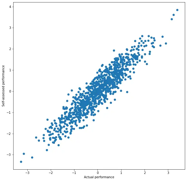
We see a strong correlation - no surprise (that’s what we assumed).
Let’s now plot X vs. Y - X, the plot which, according to the author of “DK is Autocorrelation”, introduces the correlation as an artifact.
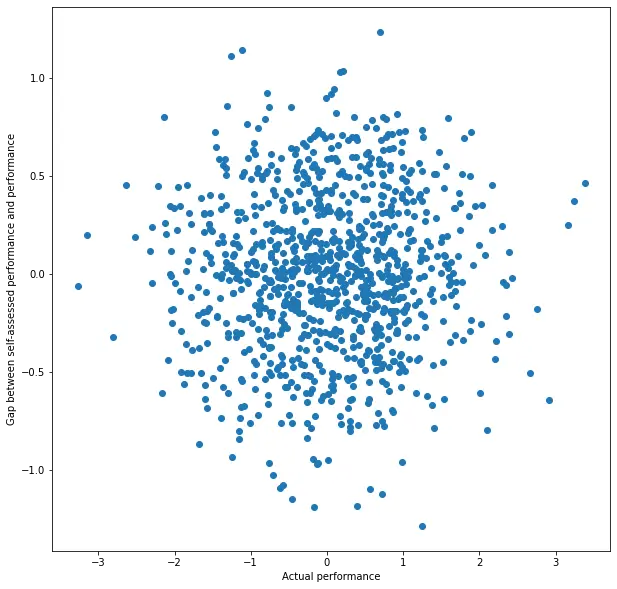
No correlation, no surprise. If people roughly know how well they perform, there’s no pattern to the relation of X and the bias (which is measured by Y - X). Notably, even though according to the author we have a case of “autocorrelation” (X vs. Y - X), it doesn’t introduce, and in fact even removes, the correlation.
What does this mean? Since that’s not the results Dunning and Kruger got, it means that our assumption is wrong. Assuming their data is correct and generalizable, that would mean people aren’t, generally, capable of self-assessing their performance or level of skill. Instead, the analysis finds biases in self-assessment, as described previously. As for the reasons for those biases, that’s not indicated from this data, though they did make some experiments to determine the reasons they put forward. But that’s another topic.
Dunning-Kruger analysis on random data assuming independence
If, like the author, we had instead chosen to assume independence, and gone on to generate data and plot the graphs, we would have indeed seen an effect similar to that observed by Dunning and Kruger. And if you pause to think about it, it makes perfect sense: such data represents a world where people have absolutely no inkling how they performed. Their self-assessment is completely random and independent of how they perform in actuality. If you choose a uniform distribution, like the author, or a normal distribution like I picked for the previous section - by the definition of the distribution and the declaration of independence, people who perform poorly are more likely to overestimate their performance than underestimate it, and vice versa for people who performed well. It’s not a “statistical artifact” - that will be your everyday experience living in such a world.
Here’s another way to look at it: by using random data to argue that the Dunning-Kruger effect is not real, the author is arguing to default to the base assumption. But which base assumption do they make? One even more radical than what’s proposed by Dunning-Kruger. In the author’s world, the Dunning-Kruger study should be interpreted in the reverse direction, claiming that there is at least some self-awareness in the way people self-assess. If the author wishes to reject that, and resort to believing people have no idea at all how they perform, well, they’re welcome, but I find it nonsensical.
Other aspects of the Dunning-Kruger Effect
There are other aspects to what Dunning and Kruger claim in their paper, most notably the claim that the more skilled people are, the better they are at self-assessing their performance. This result is supported by their plot, but in any case, my issue is not with objections to this claim, as the random data analysis isn’t relevant to that aspect.
After presenting their case for calling the Dunning-Kruger effect “autocorrelation”, the author references other studies that voice broadly the same criticism, and aim to make the same analysis but in a manner that is “free of statistical artifacts”. These studies claim to find no evidence of the specific biases of the sort Dunning and Kruger found, only an increase in self-assessment accuracy as skill increases. Concretely that would mean they found people more capable of self-assessing their performance (i.e., closer to our dependence assumption). That could be, I’m not going to start reviewing and comparing signal-to-noise ratios in Dunning-Kruger replications. Again, my main point is that there’s nothing inherently flawed with the analysis and plots presented in the original paper. That said, when I skimmed some of those papers I didn’t get the impression they make a strong case. The plot reproduced in the “DK is Autocorrelation” article (fig. 11, from Nuhfer et. al) purports to show a distinctive lack of Dunning-Kruger effect, but shows too many overlapping points to actually be able to estimate where the mean is. And maybe there’s no contradiction - there’s always room for nuance, for finding out where the Dunning-Kruger effect is relevant and where it’s not. That can be done with more studies, but only if the authors manage to agree on assumptions and basic statistical practice. Anyway. That’s far besides the point already.
Why so angry?
I know I’ve taken this far too personally. I have no illusions that everything I read online should be correct, or about people’s susceptibility to a strong rhetoric cleverly bashing conventional science, even in great communities such as HN. But frankly, for the last few years, the world seems to be accelerating the rate at which it’s going crazy, and it feels to me a lot of that is related to people’s distrust in science (and statistics in particular). Something about the way the author conveniently swapped “purely random” with “null hypothesis” (when it’s inappropriate!) and happily went on to call the authors “unskilled and unaware of it”, and about the ease with which people jumped on to the “lies, damned lies, statistics” wagon but were very stubborn about getting off, got to me. Deeply. I couldn’t let this go.
Now, not so angry
Writing this post helped me organize my thoughts and also blow some steam. I hope any future discussions on the topic will be constructive and based on shared assumptions, but even if not, I feel like I’ve done my part. I have zero illusions about convincing everyone.
Thanks for reading!