Interactive data exploration
Creating interactive data exploration utilities with dimensionality reduction and D3.js
One of the first priorities when approaching a new data task is getting to know the data, and visualizations are an integral part of the process. For me, interactive visualizations (with libraries such as plotly, bokeh or d3.js) are especially powerful in bringing the data “closer” and making it almost physically tangible.
In a few distinct cases, the standard visualizations weren’t enough for me to feel I properly grok the data, and I wanted something more. In those cases I ended up creating custom interactive visualizations to explore the data. A key aspect of those visualizations was that they contained all the samples in some condensed form, a way to interact with the samples, and additional visualizations that accompany the interaction.
In this post I’ll walk through a demo of such a utility, to explore data of taxi rides in NYC.
Skip to the demo
If you’re on desktop, you can go ahead and try the demo here, though I’d recommend skimming the post to understand what’s going on.
NYC taxi dataset
In the demo you can explore a small subset (a little less than 10K) of the New York City Taxi Ride Dataset from 2016, downloaded from Kaggle. An extensive exploratory data analysis of the dataset (with the goal of predicting the ride duration, as per the Kaggle competition), by Kaggle user Heads or Tails, can be found here.
The features I focused on in the demo are:
- Pickup location (latitude and longitude)
- Dropoff location
- Pickup time (day, hour)
- Ride duration
Here are a few samples from the dataset:
| pickup_day | pickup_time | duration_hours | pickup_lon | pickup_lat | dropoff_lon | dropoff_lat |
|---|---|---|---|---|---|---|
| 3 | 7.68 | 0.31 | -73.96... | 40.78... | -73.98... | 40.76... |
| 4 | 9.83 | 0.37 | -73.95... | 40.78... | -73.98... | 40.74... |
| 0 | 22.02 | 0.11 | -73.99... | 40.72... | -73.99... | 40.73... |
| 1 | 15.82 | 0.02 | -73.91... | 40.77... | -73.91... | 40.77... |
| 0 | 13.97 | 0.13 | -73.98... | 40.76... | -74.00... | 40.76... |
Dimensionality reduction
My primary approach for including all samples in the visualization is using some dimensionality reduction technique.
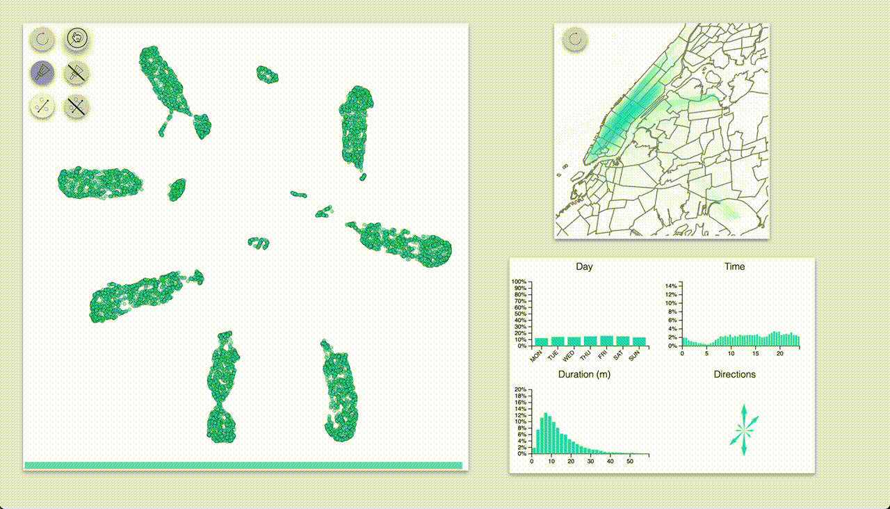
For the demo I used UMAP, which gave the following 2D embedding of the rides:

Interactive exploration
The interactive exploration utility is composed of two main areas: a visualization of the embedded samples, and another section with visualizations of the interactions.
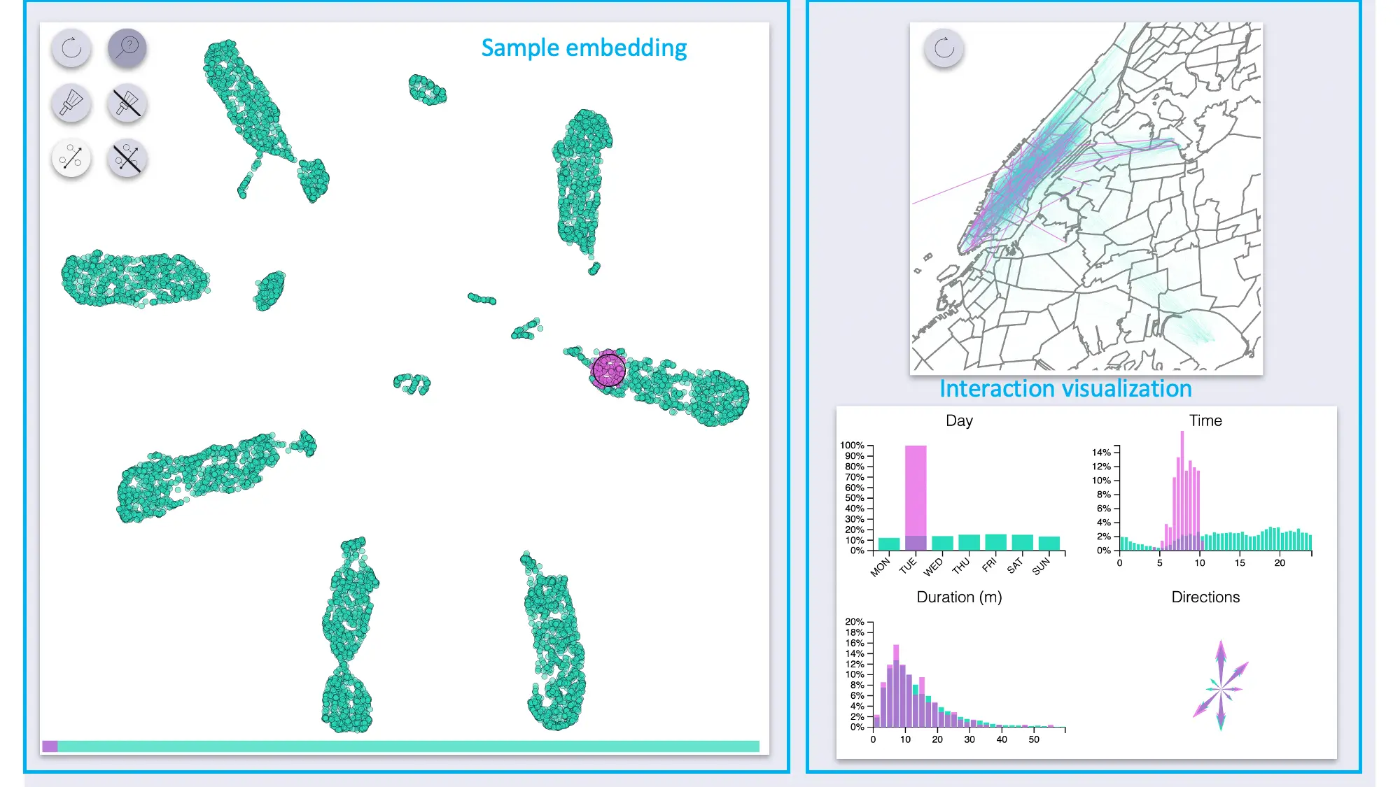
The sample area supports zoom and pan.
The “side” visualizations show the distributions of features for the full dataset as well as for highlighted samples:
- Map of all pickup-dropoff pairs
- Count plot for days
- Histograms for time and duration
- Compass-like arrows for showing the dominant ride direction
Sample and selection inspection
Two related modes involve highlighting a set of samples, and visualizing the feature distributions of the selection compared to the full dataset.
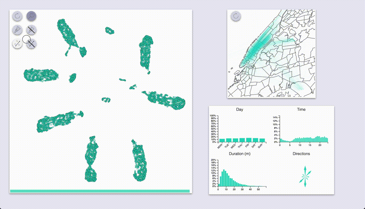
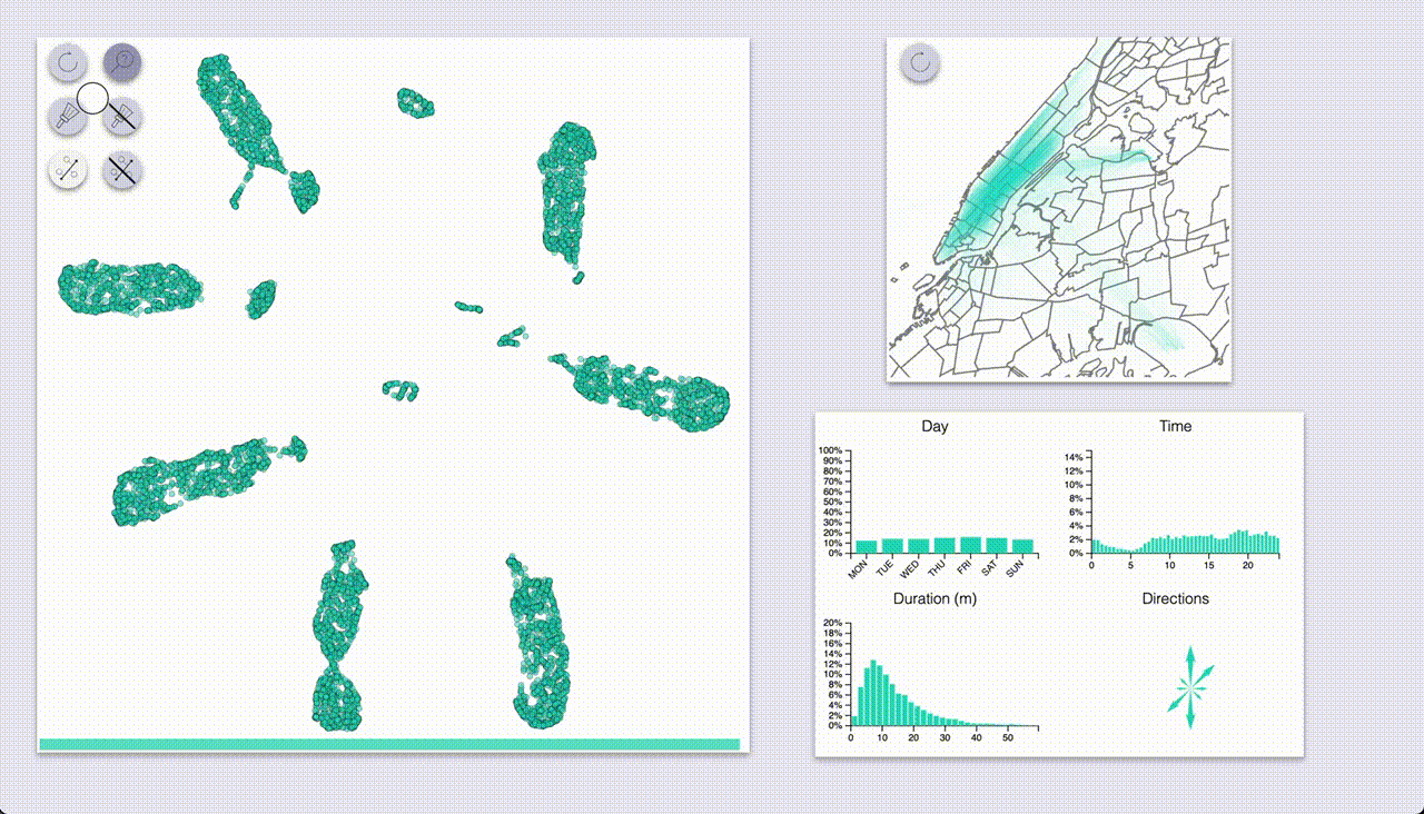
One mode (which I coined “inspection”, the one with the magnifying glass icon) provides highlighting by hovering.
The other mode (“selection”, brush icon) provides highlighting by selecting samples with a brush (by pressing the ctrl/cmd keys).
Using these we can quickly see that UMAP created a big blob for each day of the week, with some smaller blobs for specific types of rides.
The day-blobs are organized such that across their length they correspond to the pickup time, and the perpendicular direction roughly corresponds to pickup / dropoff location in Manhattan.
Each day-blob has a slightly separated portion for late-travellers from the day before (or very early?), with the size of the portion increasing as we get closer to the weekend.
Additionally, there are some smaller blobs for airport rides (JFK and LGA), some of which are also organized by time of day; these blobs seem to be split by:
- to / from for JFK (as indicated by the direction arrows)
- day of week for LGA
- Interestingly, the weekend rides from LGA have been annexed to the rest of Sunday’s rides
- Also interesting to note that rides to LGA have been mixed with the rest of the rides (unlike rides to JFK, which have a blob of their own)
The peculiarities can indicate interesting patterns in the data, but they can also be a result of the way the chosen dimensionality reduction technique works (more on that soon).
Projection tool
The projection tool (enabled only when samples are selected with the brush) allows us to specify an axis and observe how the selected samples project onto the axis, by coloring them and showing a scatterplot of pickup time and duration by projection.
This allows us to inspect the way blobs are organized, more easily than the hover inspection tool. For example, in the animation above we select the Saturday blob, first projecting it along its long axis, which we see corresponds to the pickup time; then we project it along the perpendicular axis, and see that it roughly corresponds to the ride location.
Discussion and variations
It is evident that the exploration hinges on the dimensionality reduction; a random projection, for example, would be no better (and arguably worse) than looking at random subsets of the data. Thus it’s important to choose a proper dimensionality reduction approach, and maybe even provide interactivity of the dimensionality reduction itself.
Some approaches to dimensionality reduction:
- Playing with different DR techniques (e.g. see scikit-learn’s page on manifold learning or PyMDE)
- Giving different weights to different features (up to completely removing features)
before running through a DR technique
- This can be done interactively (though might require lots of pre-computation or fast realtime-ish DR)
- If sample similarity is easy to obtain, can use multidimensional scaling or matrix factorization
- If there’s a DL model involved, can use DR on last layer representations
The main sample area doesn’t have to be a 2D embedding of the samples either. In one project with compositional data we used DR to 1 dimension (PCA), and displayed the samples as a stacked percentage chart.
Another bunch of interactive tools could allow the user to filter or highlight samples according to some criteria. This can enable a sort of ping-pong game of generating hypotheses by highlighting samples and validating them by applying criteria and inspecting the resulting patterns.
Empowering other roles in the org
Apart from using such utilities myself to play with the data, these tools were of interest to other people in the team:
- When the data was navigation flow through a mobile app, the product manager used the utility to gain a better understanding of user experience and behavior
- When the data was user interaction with content items, content moderators used the utility to understand the items as experienced by users, and uncover specific issues with certain items that led to unexpected behavior
Of course, hacking something for your own usage is very different from developing a tool used by other people (even if it’s for internal use only), so there’s obviously an effort trade-off here.
Performance considerations
Naturally, when visualizing large datasets, performance can be an issue, even a blocker.
Some tricks that can be used for performance:
- Dividing the data into pre-filtered subsets
- Not re-calculating the full subset stats but updating them based on added / removed samples
- Using an appropriate data structure (e.g. k-d tree et al.) for detecting selected samples
- Moving heavy operations server-side
- Utilizing GPU with WebGL or, hopefully soon, WebGPU - e.g. see this great post
It’s important to choose the right sort of interactivity for the tools. For example, if calculating subset distributions took a long time, doing that for every mouse move would have been a very bad idea, and a better choice could have been box or lasso selection.
Code & Disclaimers
Code for the demo can be found here.
I’m not a frontend dev, and hacked this demo over a few weekends, so some disclaimers:
- The code could certainly use a refactor, there’s a lot of global state management, code duplication etc.
- Might not look good or work smoothly on different browsers / screens
- There are probably a few bugs lurking around
- The design could use some refinement
Overall though I’m pretty happy with how it turned out.
Call for interesting data
I’m curious to learn how this idea can be applied across diverse domains. If you have data you’re struggling to grok, and think such a utility could provide value, ping me (hi@andersource.dev) - I might like to give it a shot!